Mad Heights is excited to announce an awesome new project that we are undertaking, 50 Faces. We’re combining three of our favorite things, friends, photography, and typography, in a unique and personal way.

JAY PERDUE, 50 FACES #1. TYPE: BAJERN
Our first friend to photograph and declare “a type” is Jay Perdue. The typeface Bajern, a modern geometric fraktur face, definitely suits Jay very well. As described by the creator of Bajern, Anton Bolin of Stockholm, Sweden, it’s “a typeface inspired by German frakturs with a twist of Sweden.”
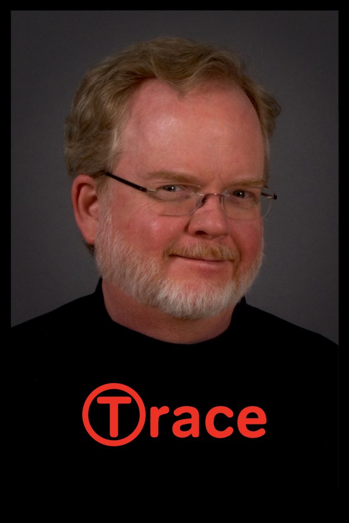
TRACE HALLOWELL, 50 FACES PROJECT #2. TYPE: TONDO
Our next friend to photograph and declare “a type” is Trace Hallowell. The typeface Tondo seems to suit Trace. As described by Dalton Maag, the international typeface design firm, “Tondo is a sans serif font family with rounded stroke terminals and superb attention to detail. Whether it is being used on screen or at display sizes on a billboard, Tondo will always stay sharp and clear. It has an appealing personality that will work well for a range of uses from wayfinding to branding or advertising applications.” That sounds a lot like Trace.

BILL WALSH50 FACES PROJECT #3. TYPE: AMERICAN TYPEWRITER
Next up to photograph and declare “a type” was Bill Walsh. Bill is a true singer/songwriter, and an incredible advertising writer. We see him pounding away in the middle of the night at an old-school typewriter, banging out ads and jingles. You can catch him at WriteOnBill.com, so right on with Bill is American Typewriter. A classy twist loaded with tons of legibility and readability. Adding a healthy dose of letterspacing makes it look like it came straight from an IBM Selectric.

PENNI WALKER, 50 FACES PROJECT #4. TYPE: LA PORTENIA DE LA RECOLETA
The next “type” is Penni. She is a real people person, and seems to be passionate about purple. The newish Argentinian type foundry Sudtipos had an array of great script typefaces to match up with Penni. La Portenia de Recoleta pays homage to the spirit of early 20th-century show card writers and type designers and is the definitive winner; it is slightly more formal and polite than the alternative Portenia de la Boca variant with its longer, more extravagant flourishes and indulgencess in more interletter space


DAVID SCOTT, 50 FACES PROJECT #5. TYPE: ITC WILLOW
I put the stamp of approval on this guy with ITC Willow. Although a contemporary typeface, ITC Willow is a throwback to the Scottish Arts and Crafts style of Charles Renee Mackintosh. The type is based on his design in the late 1890s of the Willow Tea Room in Glasgow, Scotland. A perfect face for this Scott.
More faces on the way!